
If you’re looking for the best readable subtitles and video captions for free, you’re in the right place. In this article, we cover everything about transcript fonts that will help both you and your viewers easily read what the video says.
4 Best Fonts for Video Subtitles and Captions.

1. Arial
On the internet, Arial is one of the most commonly used default font options, and people generally find it comfortable to read on screens, whether they are using Android, PC, or larger displays. Arial was designed in 1982 by Robin Nicholas and Patricia Saunders for Monotype, initially as a substitute for Helvetica. Its simple, sans-serif style makes it versatile for various purposes, including documents, presentations, websites, and even for subtitles or captions.
Arial is a popular choice for subtitles due to its high readability and clarity on screens. Its even spacing and lack of decorative elements. it remains legible even at smaller sizes, which is critical for subtitles that often need to be read quickly.
2. Roboto
Roboto offers a modern and clean aesthetic, balancing mechanical structure with friendly. its integration into Google platforms and Android devices. it made it widely accessible and popular in apps, websites, and multimedia content.
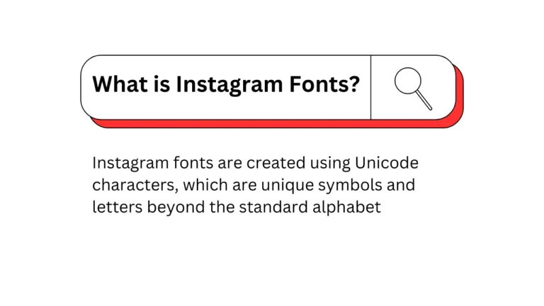
Must Read: How To Create an Instagram Aesthetic
3. Poppins
Poppins, designed by the Indian Type Foundry, is a widely used font for subtitles. If you want more weights in your text, it is perfect for that. Poppins is suitable for subtitles, headings, and body text.
Its balanced letterforms and consistent strokes make it ideal for captions on YouTube and Instagram.
4. Helvetica
Helvetica Neue is a sans-serif typeface. It has been widely adopted by many brands and video editors. Considered a cultural icon in design, it has a classic look that remains relevant and stylish, avoiding the risk of becoming outdated.
How To Choose Fonts For Caption and Subtitles
- Use clear, legible fonts (e.g., Arial, Helvetica).
- fonts that are easy to read, even at smaller sizes
- Choose colors that stand out against the background.
What Are the Best Font Type and Size for Subtitles in Videos?
The right font, at the right size, helps the subtitles be easily readable. Clear sans serif fonts-such as Arial and Helvetica-are the best; text should be readable on different screens, and usually looks best in 22 to 28 points for font size.
More importantly, it should also contain sufficient contrast between the text and the background. Subtitles are therefore easier to read for this reason. Keep each subtitle line under 40 characters. This will help keep your text clean and easy to read.
Video subtitles written in the same style as the rest of your video appear much more professional. It also keeps the viewers interested. Along with these tips, it will help your subtitles become clear and easy-to-read for everyone.
Best Fonts for On-Screen Subtitles?
Fast and great for YouTube, SubRip Subtitle. WebVTT has more control over text orientation and formatting than others. TTML is for advanced formatting but is not the most common type.
Also, make sure that your subtitle files are UTF-8 encoded. Most people find SRT to be the easiest. Test your subtitles on YouTube and make sure everything fits perfectly. This can increase accessibility and the consumption experience.